Power BI, surprisingly, lacks a robust calendar slicer that is both capable of showing visual data, slicing dates from a calendar perspective, and also allowing those dates to be consistently synced between report pages. Here is the solution I found, which is now powering a lot of my reports.
The problem
The available options before this solution are limited:
- Matrix visual as a hack: works for cross-filtering, but it is not a real slicer and does not sync state between pages.
- Third-party visuals: most are not free. Among the free ones, none gave me a complete solution. They basically lack modern features (I tried this one). I've also tried this one, which was very cool, but the selected month did not sync between visuals on different pages (the month not the selected date). It also lacks some features, and the applied measure doesn't retain the month context in which it's displayed which to me is a bug.
The solution: reconfigured Button Slicer
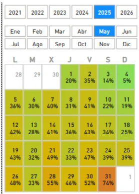
The key is to use the native Button Slicer in Power BI with a specially built dates table that distributes buttons in the shape of a monthly calendar, with a data heatmap included.
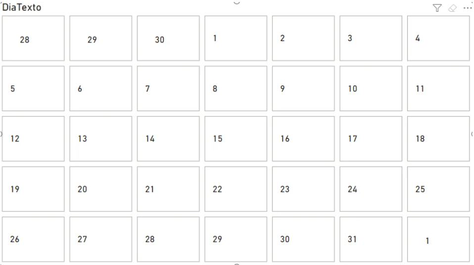
Like you see in the image. I was able to build a month calendar visual that displayed all weeks with the corresponding day number shown on the appropriate weekday column and also display a heatmap with data.
I combine this visual with other buttons to select the year and the month, although this can be set in any other way you want:

It feels great when selecting another month or year and sees that all the buttons rearrange to conform a perfect and accurate month calendar slicer.
Note
Note that I'm using a Monday to Sunday configuration. But it's easy to change it, so Sunday goes first.
The following are the steps to achieve this.
Step 1: The slicer dates table (Power Query)
Create a new table in Power Query. Let's call it SlicerCalendarDates. This table generates all dates in a range and expands them by week so that each date appears in its correct weekday column within its related month.
let
    // 1. Build a list of dates
    StartDate = Date.AddYears(Date.StartOfMonth(Date.AddMonths(Date.From(DateTime.LocalNow()), 7)), -5),
    Current_Date = DateTime.Date(DateTime.LocalNow()),
    Current_Month = Date.Month(Current_Date),
    EndDate = Date.AddMonths(Date.EndOfMonth(Current_Date), 12),
    DateList = List.Dates(StartDate, Duration.Days(EndDate - StartDate) + 1, #duration(1, 0, 0, 0)),
    BaseTable = Table.FromList(DateList, Splitter.SplitByNothing(), {"Fecha"}),

    // 2. Add the start of the week (monday in my case)
    AddStartOfWeek = Table.AddColumn(BaseTable, "InicioSemana", each Date.AddDays([Fecha], -Date.DayOfWeek([Fecha], Day.Monday))),

    // 3. Build the whole week list of all the seven days from monday)
    AddDiasSemana = Table.AddColumn(AddStartOfWeek, "DiasSemana", each List.Transform({0..6}, (i) => Date.AddDays([InicioSemana], i))),

    // 4. Expand the list of dates of the week into rows
    ExpandDiasSemana = Table.ExpandListColumn(AddDiasSemana, "DiasSemana"),

    // 5. Add column with the month that the date corresponds to
    AddMesRelacionado = Table.AddColumn(ExpandDiasSemana, "MesRelacionado", each Date.Month([DiasSemana])),

    // 6. Add column with the year that the date corresponds to
    AddAnioMesRelacionado = Table.AddColumn(AddMesRelacionado, "AnioMesRelacionado", each Date.Year([DiasSemana])),

    // 7. Add the long and short name of the month
    AddNombreMes = Table.AddColumn(AddAnioMesRelacionado, "NombreMes", each Text.Proper(Date.ToText([DiasSemana], "MMMM"))),
    AddNombreMesCorto = Table.AddColumn(AddNombreMes, "NombreMesCorto", each Text.Start([NombreMes], 3)),

    // 8. Add the week of the month
    AddSemanaAnio = Table.AddColumn(AddNombreMesCorto, "SemanaAño", each Date.WeekOfYear([Fecha], Day.Monday)),

    // 9. Remove other columns
    ColumnasSeleccionadas = Table.SelectColumns(AddSemanaAnio, {"Fecha", "SemanaAño", "MesRelacionado", "NombreMes", "NombreMesCorto", "AnioMesRelacionado"}),

    // 10. Remove duplicates by date, week and related month
    QuitarDuplicados = Table.Distinct(ColumnasSeleccionadas),

    // 11. Add day number
    AddDia = Table.AddColumn(QuitarDuplicados, "Dia", each Date.Day([Fecha])),

    // 12. Add day number as text adding an extra padding before so has a different value wheter is the 30th of the previous month or the 30th of the current month.
    AddDiaTexto = Table.AddColumn(AddDia, "DiaTexto", each (if Date.Month([Fecha]) <> [MesRelacionado] then "ㅤ" else "") & Text.From([Dia])),

    // 13. Add a column to apply the order to the text day of the previos step.
    AddOrdenDiaTexto = Table.AddColumn(AddDiaTexto, "OrdenDiaTexto", each
        let
            fecha = [Fecha],
            dia = Date.Day(fecha),
            mesFecha = Date.Month(fecha),
            anioFecha = Date.Year(fecha),
            mesRel = [MesRelacionado],
            anioRel = [AnioMesRelacionado],
            deltaMeses = (anioFecha - anioRel) * 12 + (mesFecha - mesRel),
            orden =
                if deltaMeses = 0 then dia
                else if deltaMeses = -1 then -600 + dia
                else if deltaMeses = 1 then 600 + dia
                else null
        in
            orden,
        Int64.Type
    ),

    // 14. Add a bool column to know if this row belongs to the same month or it is from another month
    #"Add MismoMes" = Table.AddColumn(AddOrdenDiaTexto, "MismoMes", each Date.Month([Fecha]) = [MesRelacionado]),

    #"Tipo cambiado" = Table.TransformColumnTypes(#"Add MismoMes",{{"MesRelacionado", Int64.Type}, {"SemanaAño", Int64.Type}, {"NombreMes", type text}, {"Fecha", type date}, {"NombreMesCorto", type text}, {"AnioMesRelacionado", Int64.Type}, {"Dia", Int64.Type}, {"DiaTexto", type text}, {"MismoMes", type logical}}),
    #"Columnas reordenadas" = Table.ReorderColumns(#"Tipo cambiado",{"Fecha", "SemanaAño", "MesRelacionado", "MismoMes", "NombreMes", "NombreMesCorto", "AnioMesRelacionado", "Dia", "DiaTexto", "OrdenDiaTexto"}),

    // 15. Add delta date column that will create an invalid date for the dates that don't belong to the same month
    #"Add DeltaDate" = Table.AddColumn(#"Columnas reordenadas", "FechaDelta", each if [MismoMes] = false then Date.AddYears([Fecha], -150) else [Fecha]),

    #"Tipo cambiado1" = Table.TransformColumnTypes(#"Add DeltaDate",{{"FechaDelta", type date}})
in
    #"Tipo cambiado1"
Why the duplicate rows are intentional
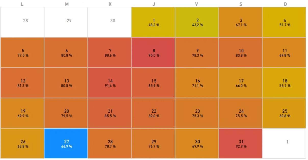
April 28, 29, and 30, for example, appear duplicated: one row belongs to April (its natural month), and another belongs to May (because those days fall in the first week of May). This is correct and necessary for the calendar to show the grey adjacent-day cells.
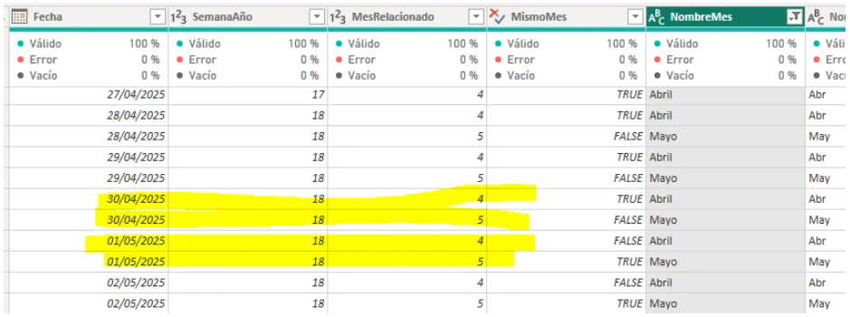
The blank unicode character trick (ㅤ) in step 12 lets the same day number (e.g. "30") have two distinct text values depending on whether it belongs to the displayed month, keeping the correct button order in the slicer. Step 13 then adds a numeric order column so that a day with the unicode prefix always sorts before the same day without it.
On step 15 we added a "Delta Date" column that is the date column we will connect to our date table. This date will convert the dates that don't belong the natural month to "impossible" dates or dates that don't have any records on my main dates table. I did this so that the measures become much easier to calculate. I didn't need to slice by or show any data on those dates.
Step 2: Sort DiaTexto by OrdenDiaTexto
In Power BI's table view, select the DiaTexto column and apply "Sort by column" → OrdenDiaTexto. This ensures buttons appear in the correct order.
Step 3: Relationship with the main dates table
Connect SlicerCalendarDates to your main dates table using FechaDelta → Date with a many-to-many relationship and single-direction filtering (only SlicerCalendarDates filters the dates table).
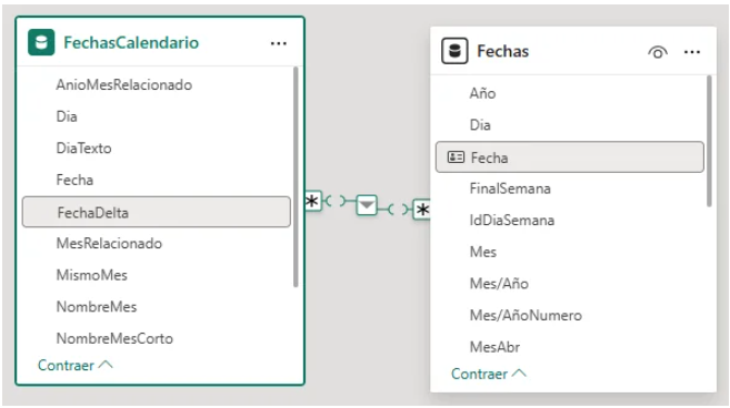
As mention earlier, by using FechaDelta instead of Fecha, adjacent-month days point to non-existent dates (150 years back), so they bring no data from the main table. This makes measures much easier to write.
Step 4: Configure the Button Slicer
- Add the Button Slicer to the report.
- Set the field to
DiaTextoonly. - In the visual format set: maximum 6 rows and 7 columns (one per day of the week).
You should see the buttons rearrange automatically when switching months.
The tedious part: aligning the weekday header
The visual title does not accept consecutive normal spaces — Power BI ignores them. Use the blank unicode character (ㅤ) to manually space the weekday letters in the title. A real example:
"ㅤㅤㅤㅤL ㅤㅤㅤㅤㅤㅤㅤㅤMㅤㅤㅤ ㅤㅤㅤ ㅤX ㅤ ㅤㅤ ㅤㅤㅤㅤJㅤ ㅤㅤㅤㅤ ㅤㅤV ㅤㅤㅤㅤㅤㅤㅤㅤSㅤ ㅤㅤㅤㅤㅤㅤㅤD"
Adjust the spacing based on your visual width and button margins.
Info
This is the hard / tedious part.
Step 5: Conditional formatting
Use the slicer's conditional formatting for the heatmap and button states. You will create auxiliary measures so that:
- Adjacent-month days get a white background and grey text.
- Current-month days get a color gradient based on your measure value.
- For adjacent days, return the background color as the measure value so the gradient doesn't bleed into those cells.
Key point: REMOVEFILTERS in your DAX measures
Warning
Any measure that operates on date context needs to remove the SlicerCalendarDates filter to work correctly.
Example with previous year sales:
Sales PY = CALCULATE(
    [Sales],
    REMOVEFILTERS(SlicerCalendarDates),
    SAMEPERIODLASTYEAR(Dates[Date])
)
Without REMOVEFILTERS, the slicer table interferes with time intelligence functions.
Final result
A monthly calendar that:
- Shows each day in its correct weekday column.
- Displays a data heatmap on the buttons.
- Syncs natively between report pages.
- Slices by date other visuals
- Rearranges dynamically when selecting a different month or year.
Note
You can change the size of the visual so it can fit in different places, but remember that you will have to play with the unicode char for the tittle.